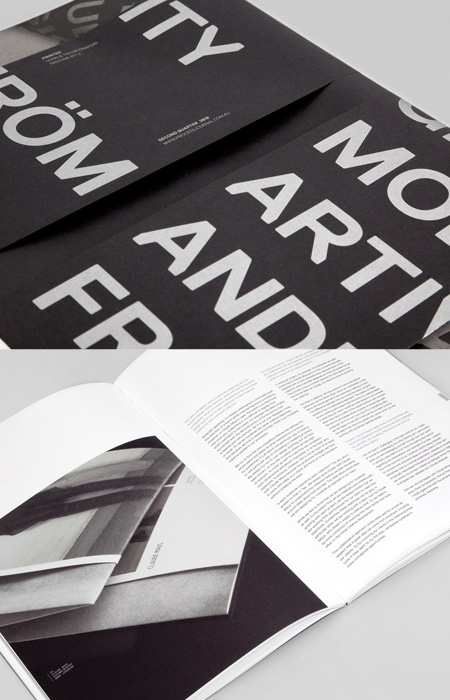
Thomas Williams, one of the talents behind the excellent Process Journal, has documented the changes that were made to the grid system for Edition Two of the journal. Thomas writes:
The Process Journal grid has undergone several updates for Edition Two, the major change being an increase in the size of the internal gutter from 30mm up to 40mm. Although this may appear to be only a minor adjustment, it changes the dynamics of the grid in several different ways.
The extra 10mm was taken from the outside columns, otherwise reserved for image captions and room for the reader’s thumbs to hold the publication (with minimal overlay of the content). The space was removed evenly from these columns to minimize the change in visual consistency from the previous edition.
Increasing this gutter also proved to be advantageous to the overall layout of the publication and resulted in three outcomes: firstly, by centralizing the content further into the middle of the page allowing more padding and easier reading of type that falls within the two central columns; secondly, it allows a larger clearance for images placed over or near the edge of the gutter—thus minimizing the loss of image into the spine; and lastly, the increase results in an overall wider area of content.
The original objective was to create a grid that was flexible enough to deal with a wide range of content, enable flexibility and retain visual consistency. This objective still remains; hence the vast majority of grid has been unaltered and has proven itself worthy for a second time. In our experience it is a rare to have the chance to revisit and refine a project so we have embraced the opportunity and believe that small changes like these contribute to our endeavor of producing an always-improving publication.


