RM Pro

RM Pro is a new typeface designed by Mark Bloom of Mash Creative. It’s available in 3 weights – Light, Regular and Bold – as OpenType, and WebFont formats, and includes alternate a’s and l’s, plus a full set of Eastern and Central European characters.

RM Pro is available to buy exclusively from T:D:F, and you’ll receive a free limited edition 32 page type specimen book on full family purchases.

23a5689

Build: Nike – Track and Field

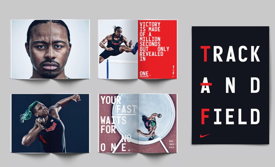
Beautiful new graphic system by Build for Nike’s Track and Field brand.

This comprehensive graphic system includes — Typography, typographic messaging, graphic marks, and patterns, including bespoke numerals. Culminating in a fresh and bold visual centre for use in all Track and Field branded applications, from press advertising, billboards, wild posting, OOH, apparel and event branding.

Athlete photography by Carlos Serrao. Art Direction by Rebecca Parker (Nike).

01-build-nike02-build-nike06-build-nike03-build-nike04-build-nike05-build-nike

Dot Zero – Issue 1

Dot Zero Issue 1

Dot Zero Issue 1

Dot Zero Issue 1

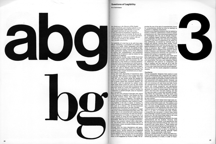
Dot Zero was a quarterly by Unimark in partnership with Finch Paper that focused on the theory and practice of visual communication. Only five issues were published between 1966 and 1968, and Massimo Vignelli was the designer and creative director of the magazine. Vignelli wanted to make the design exciting, but simple, so he set all type in only two weights of Helvetica and everything printed in black and white.

Michael Bierut interviewed Vignelli about the magazine. Some nice insights on how the publication came about, and its production.

The folks at Rationale Design have made available a hi-res PDF of issue 1 of Dot Zero, and you can see some photos of issue 2 here.