Build: Nike – Track and Field

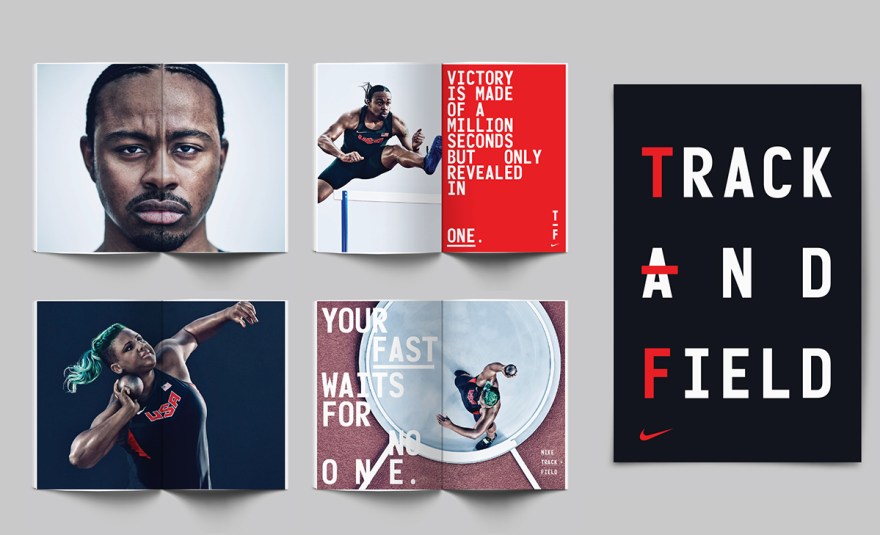
Beautiful new graphic system by Build for Nike’s Track and Field brand.

This comprehensive graphic system includes — Typography, typographic messaging, graphic marks, and patterns, including bespoke numerals. Culminating in a fresh and bold visual centre for use in all Track and Field branded applications, from press advertising, billboards, wild posting, OOH, apparel and event branding.

Athlete photography by Carlos Serrao. Art Direction by Rebecca Parker (Nike).

01-build-nike02-build-nike06-build-nike03-build-nike04-build-nike05-build-nike

There

three.jpg

You have to respect any studio that has Brockmann and Crouwel posters on their walls. There, an agency based in Australia, has compiled an excellent body of work.

On a side note: I don’t like how their site functions. It’s pretty and all but it becomes very annoying when I have to wait for a new piece to load in Flash. It ends up taking forever to see all of the work and I quickly lose interest. I also don’t like that you can’t easily see all the work at once, even in thumbnail form. All the work should be right there and easy to view rather than having to explore the site in the dark. A good portfolio displays all the work at once, clearly and organized, so it makes viewing faster and more exciting. Area 17 is a great example of this. Flash is definitely the biggest cause for this issue. I think it’s being used more and more in a way where it’s become a barrier between the user and the work. In my opinion a simple CSS site works so much better for portfolios.

I’m not trying to trash There, they do awesome work, it’s just something I’ve been bothered with for some time now and needed to vent.        

My Avant Garde Collection

agmag.jpg

Recently I started to collecting vintage Avant Garde Magazines, mainly the ones with the pretty covers full of Avant Garde goodness. Herb Lubalin did a wonder job with this magazine. His interior layout designs are simple, clean and beautiful to look at and the typeface is one of my favorites. It’s amazing how the typeface has gone on to be such a big part of the modern design culture. I see the damn thing everywhere, even in cheesy catalogs and signage, and it’s butcher most of the time. But when used correctly it can be a wonderful thing.

Anyway, my collection is small, it only consists of issues 8, 11 and 13. Issue 8 is unique since it was released with 3 different covers. One white, one tan and one in a thick brown paper stock. Looks great in person.

Check out my Flickr page for more photos.        

Sexiest Form You Ever Saw

terraceform.jpg

This is probably the sexiest form I’ve seen in a while. Right up there with that Eames form. I want one.

It was created by Ewan Robertson of Oscar And Ewan for Terrace Studios, a gallery in Dalston, London. The project includes identity, design and a website which you can check out there.