Great brand identity work by New York and Spain based design consultancy, Atlas.


AisleOne. A visual journal on design, photography, film, music and culture.
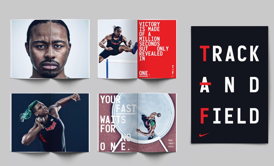
Beautiful new graphic system by Build for Nike’s Track and Field brand.
This comprehensive graphic system includes — Typography, typographic messaging, graphic marks, and patterns, including bespoke numerals. Culminating in a fresh and bold visual centre for use in all Track and Field branded applications, from press advertising, billboards, wild posting, OOH, apparel and event branding.
Athlete photography by Carlos Serrao. Art Direction by Rebecca Parker (Nike).


Jesse Reed & Hamish Smyth, the fellas behind the wonderful 1970 NYCTA Graphics Standards Manual reissue, have announced a new Kickstarter for the reissue of the 1975 NASA Graphics Standards Manual.
The original manual was created in 1975 as part of a NASA redesign done by Richard Danne and Bruce Blackburn, and it’s an important piece of American graphic design history. I’ve been on the lookout for years for a copy of the manual, but I still haven’t be able to find one. It’s super rare. That’s what makes this project so great. The manual will now be available to the general public, so everyone will get to enjoy it.
The reissued manual will be based on the Danne’s personal copy, and should ship in March 2016. Jesse and Hamish did an incredible job on the NYCTA manual, so I’m sure this reissue will be just as good. I’m definitely backing the project.
Here are the specs:


Wonderful identity design by Atlas for the Barcelona Design Museum. You can see more of Atlas’ excellent work on Facebook and Instagram.

Design agency Northern Army has created this wonderful project that preserves Canadian logo design. There are some not-so-great designs, but so many gems.


Spin has recently design this new identity for The University for the Creative Arts in England, that is based on the simple stencil. The identity will be applied to stationery, website, print, motion graphics, signage, and environmental graphics.