The Sameness Booklet

sameness-booklet.jpg

The art and cultural movement, De Stijl, promoted abstraction by simplify design to its most basic elements and utilizing vertical and horizontal orientations and primary colors.

The Sameness Booklet by Alex Fuller and Gabe Usadel pays homage to this Dutch movement with some beautiful, but simple spreads using only red, black and white. This stunning piece is offset printed and is typeset in Akzidenz Grotesk. Alex and Gabe are also responsible for a equally wonderful booklet titled: The Incredible Journey that is Consciousness.

You can order a copy of the book for $12.


Unit: Design/Research 02 – Space & Structure

unit-editions-design-research-02.jpg

Issue two of the excellent newspaper series by Unit Editions takes a look at Form, a quarterly art magazine published in Great Britain between 1966 and 1969. The magazine includes an interview with Philip Steadman, co-editor, publisher and designer of the magazine.

I’ve seen only a handful of copies of Form for sale over the last few years, but never picked one up. That has now changed. This is probably going to be my new obsession.

U:D/R 02 is edited by Tony Brook & Adrian Shaughnessy, and designed by the awesome studio Spin. The newspaper is 64pp, 4-colour tabloid (folded to 290 x 190mm) with card wrapper printed 1 PMS. You can grab a copy for £7.50.        

Letterheads

anton-stankowski-letterhead.jpg

I very much enjoy this letterhead design by Anton Stankowski. The grid-based structure and asymmetrical layout create a really interesting visual. This letterhead is part of James Phillips Williams’ collection that he often features on his blog, Amass. Check out the site, it’s a keeper. He also owns another gorgeous letterhead that was designed by Herbert Bayer.

If you want more letterhead goodness, head over to the blog Letterheady. The site features a ton of excellent letterhead designs of well known figures like Babe Ruth and Henry Ford. My personal favorites are the letterheads of Houdini and Charlie Chaplin. I can surf this site all day long.        

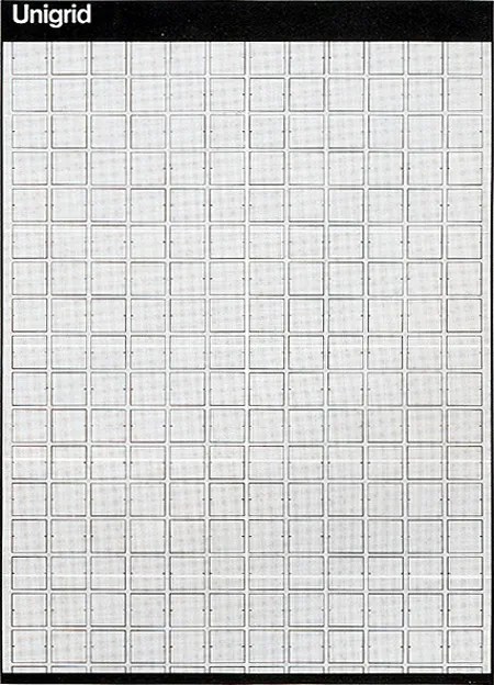
Massimo Vignelli’s Unigrid System

massimo-vignelli-unigrid.jpg


In 1977, Massimo Vignelli designed the Unigrid System for the National Park Service. The module grid system sized at ISO A2 (16.5? × 23.4?or 420mm × 594mm) allowed the NPS to created brochures in ten basic formats and to keep a consistent, recognizable structure across all it’s materials. Not to mention how economical the system has been for them. The grid features a black bar at the top and bottom with text set in Helvetica in the header bar.

It’s pretty incredible how the Unigrid is still in use today. It just goes to shows how flexible a grid system can be when properly designed.

Issue Journal has an in-depth article on the Unigrid and you can see the grid in action in this Flick group. Also, check out this larger scale redraw of the grid.


Lacoste: The Element Of Style

lacoste-the-element-of-style.jpg


There’s something about the Lacoste brand and products that I love:  they’re well-designed, detailed and minimal. So I’m excited to see that these concepts were extended to their new book, Lacoste: The Element Of Style? by Olivier Margot?. The book presents the visual history of this classic brand in a well-designed package. I personally love the simple design of the cover — which comes in 5 different color-ways — and the canvas texture.

I did some quick searching and couldn’t find any info on the designer of the book. I wonder if Lacoste did it themselves.

You can grab a copy of the book from Amazon or Assouline?.