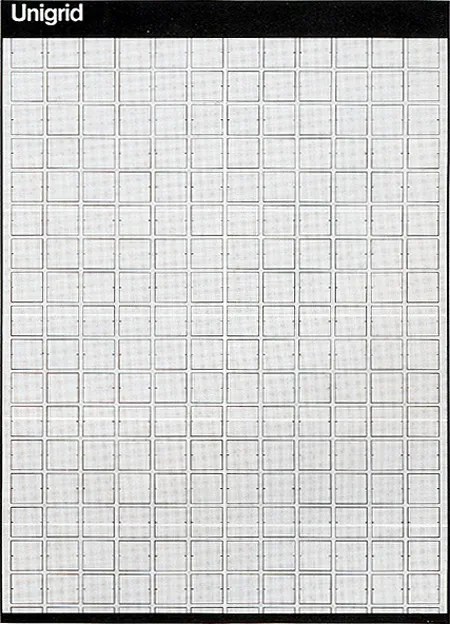
In 1977, Massimo Vignelli designed the Unigrid System for the National Park Service. The module grid system sized at ISO A2 (16.5? × 23.4?or 420mm × 594mm) allowed the NPS to created brochures in ten basic formats and to keep a consistent, recognizable structure across all it’s materials. Not to mention how economical the system has been for them. The grid features a black bar at the top and bottom with text set in Helvetica in the header bar.
It’s pretty incredible how the Unigrid is still in use today. It just goes to shows how flexible a grid system can be when properly designed.
Issue Journal has an in-depth article on the Unigrid and you can see the grid in action in this Flick group. Also, check out this larger scale redraw of the grid.
This is pretty cool, very clever! Thanks for posting it.
Nice! Do you know if it is available in vector format somewhere?
Not sure where you can find a vector version of the grid.
A masterpiece worthy of recognition.
I was struck by this last year when my family and I visited a park office and picked up some maps and information. I actually saved one of the pieces as a design reference—a testimony to the vitality of the work in the field.
As of a few years ago, Vignelli’s original presentation boards for the system sat in the NPS design offices, amongst the morgue of different folders designed over the years. As an intern there, I was amazed they just sat there, untouched, as if they would remain there for 30 more years.
The grid is changed slightly now (and expanded for usage with signage and different folder sizes) and the typefaces modernized, but Vignelli’s black band remains pretty true to how it originally was established. I think much of Vignelli’s systems seem forced today, but his work for the Park Service, much in need of an efficient and logical system, really stand the text of time.
There is a new web based grid called The Square Grid which is similar to this idea: http://thesquaregrid.com
Nice disclose.
Web Design