This is a poster designed by the awesome folks at Experiment Jetset for an exhibition titled “Club Céramique” by NAiM/Bureau Europa. I love how The Jet mixes in photography with type.
AisleOne. A visual journal on design, photography, film, music and culture.

This is a poster designed by the awesome folks at Experiment Jetset for an exhibition titled “Club Céramique” by NAiM/Bureau Europa. I love how The Jet mixes in photography with type.

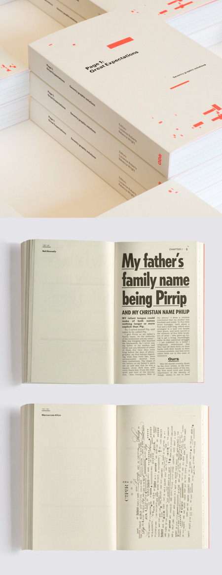
GraphicDesign& publishing house is releasing its first title, Page 1: Great Expectations. The book includes 70 different typographic interpretations of the first page of Dickens’ novel Great Expectations from some of today’s best designers.
Contributors include: APFEL, Phil Baines, Tony Brook, Cartlidge Levene, Tony Chambers, William Drenttel and Jessica Helfand, Experimental Jetset, Fraser Muggeridge, KarlssonWilker, Frith Kerr, Robin Kinross, Ellen Lupton, Luke Hayman, Morag Myerscough, Erik Spiekermann and Sam Winston.
Page 1 is 110mm x 178mm and contains 320 pages. The cover is printed in two colours and foiled on 300gsm Olin Rough Cream. The interior pages are printed in black on 70gsm Ensonovel. A letterpress tip-in is also included.
You can pre-order the book now.

Font Bureau has created this wonderful mini-site all about the excellent typeface Neue Haas Grotesk. It explains the history of the face, along with a nice section on its features and what makes it different from Helvetica. An instant valuable resource.

The folks at HypeForType approached graphic designer Ryan Atkinson to produce their first magazine, Typographic Revolt. The mag acts as a showcase for their typeface collection and is A2 sized with a twist. Instead of following the traditional convention, Ryan designed a quick read through A2 magazine which also doubles up as a set of 4 Exclusive Faces posters. Each page folds out to create a double sided poster perfect for your studio or home wall space. Typographic Revolt is printed as a limited litho run on 90gsm wood free paper, giving everything a premium newspaper feel which absorbs the inks to create a beautiful desaturated look and feel.
Typographic Revolt is available now through Amazon.

Beautiful packaging and identity design by Atipus for Fruita Blanch. Great color and typography give the identity a certain character.

RM Regular is a new sans-serif typeface by Mash Creative. The Opentype font includes a full character and glyph set, and supports 47 languages.
The first 100 people to buy the font also receive a limited edition poster printed on 200gsm GF Smith Accent Smooth Glacier White stock.