Ezra Stoller

20110705-012043.jpg

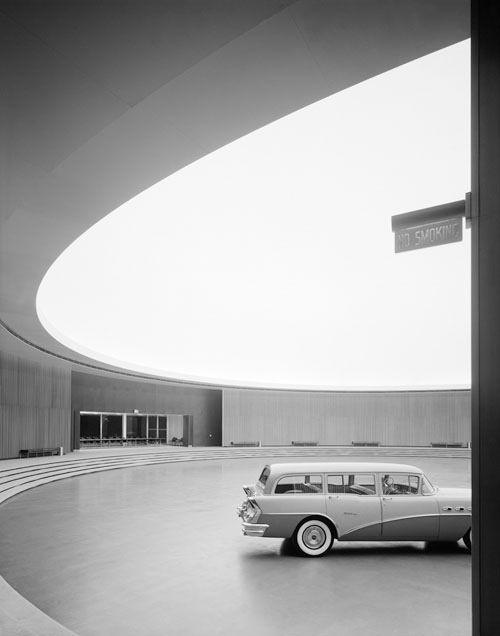
Ezra Stoller (1915 – 2004) was an architectural photographer who’s work included iconic structures like Frank Lloyd Wright’s Fallingwater and the TWA Terminal at JFK Airport.

I love how he managed to capture the lines of the structures so well. He had a gift of knowing the perfect angle and composition to use to make the architecture have real impact. Like in the image pictured here, in which the curvature of the opening in the roof and the staircase live harmoniously.

You can see more photos on his work here.

Marius Roosendaal

Marius roosendaal

Fantastic work by Netherlands by designer Marius Roosendaal. I really love the worn look given to each piece. He also uses a lot of design queues frequently found in pieces from the modernism movement. Makes them feel like they were designed in the 50s and 60s. Love it.

Via Wanken

Really Useful Posters

mash-really-useful-posters.jpg

The uber-talented Mark Bloom of Mash Creative just wrote in about these gorgeous ‘Really Useful’ posters they’ve created, extending the philosophy and thinking behind their State of the Obvious brand. The series consists of four themed posters: Greenwhich Mean Time, Emoticons, Print Sizes and Metric Conversion information and are available in A0, A1 and A2 sizes exclusively from Print Process.

Some people will find these designs to be boring, but I personally find them to be visually stimulating. The obvious grid, simple but rich color palette and staggered typography create interesting designs that are reminiscent of the classic International Typographic Style from the 50s and 60s. This is the kind of stuff that gets my creative juices flowing.

Network Osaka – Stanford University Poster

network-osaka-stanford-poster.jpg

I’ve been a fan of Network Osaka’s work for a while now, and this A1 silk screen poster for Stanford University floored me when I saw it. I love the choice of colors and the overprint look, as well as the use of photography to really bring the entire piece together. This design feels fresh but also seems like it could be a poster right out of the 60s. It must be a beauty in person.

Definitely check out Network Osaka’s full portfolio. A lot of excellent design in there.