Bernard Cycling Kit

Bernard Cycling Kit

I’m a big fan of sports jerseys of all types, and this Bernard cycling kit has to be the best looking one I’ve seen. Great use of color and type. It definitely stands out from the rest of kits I’ve seen. Most are just terribly designed. I couldn’t find much info, but it seems to be a personal cycling kit designed by Brandon Sincock that was made available for sale for a bit. Must have been a blast to design this. One of my dream jobs would be to work for a bicycle company designing frame graphics.

Page 1: Great Expectations

Page 1: Great Expectations

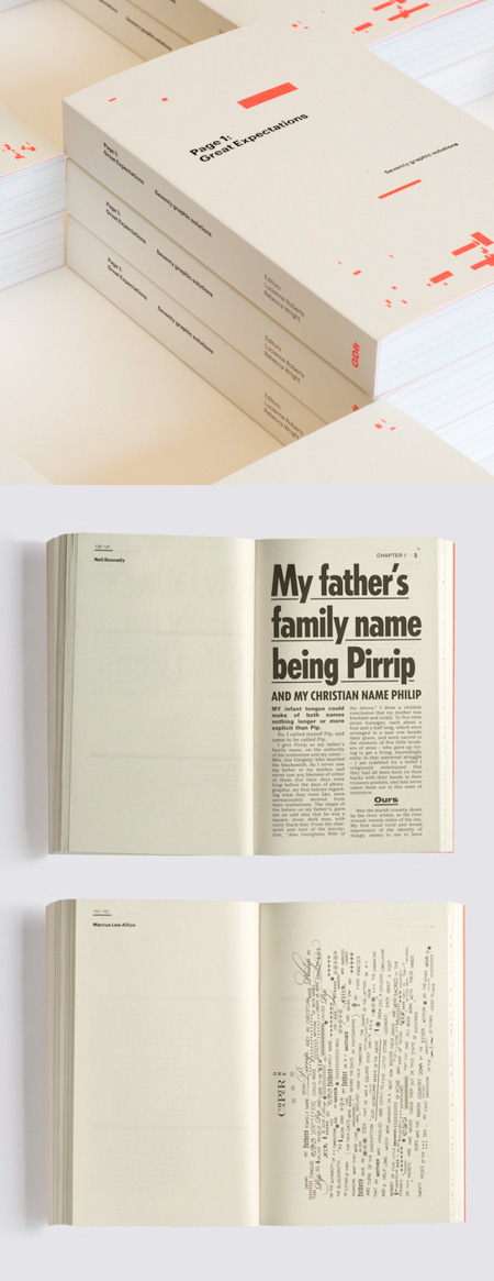
GraphicDesign& publishing house is releasing its first title, Page 1: Great Expectations. The book includes 70 different typographic interpretations of the first page of Dickens’ novel Great Expectations from some of today’s best designers.

Contributors include: APFEL, Phil Baines, Tony Brook, Cartlidge Levene, Tony Chambers, William Drenttel and Jessica Helfand, Experimental Jetset, Fraser Muggeridge, KarlssonWilker, Frith Kerr, Robin Kinross, Ellen Lupton, Luke Hayman, Morag Myerscough, Erik Spiekermann and Sam Winston.

Page 1 is 110mm x 178mm and contains 320 pages. The cover is printed in two colours and foiled on 300gsm Olin Rough Cream. The interior pages are printed in black on 70gsm Ensonovel. A letterpress tip-in is also included.

You can pre-order the book now.

Bosh Magazine

Bosh Magazine

Back in 2007, the creators of the motorcycle magazine DicE included a 16 page skate magazine called BosH in the middle of it. The magazine features images that spanned the early days of skating, and also interviews with skate legends like Steve Olson and Duane Peters. BosH only lasted 3 years, but it seems to me like it was one of the best skate publications produced in a while. I really love the cover designs and the use of minimal photography, and the type is perfect.

Via Ian Claridge

Typographic Revolt

Typographic revolt

The folks at HypeForType approached graphic designer Ryan Atkinson to produce their first magazine, Typographic Revolt. The mag acts as a showcase for their typeface collection and is A2 sized with a twist. Instead of following the traditional convention, Ryan designed a quick read through A2 magazine which also doubles up as a set of 4 Exclusive Faces posters. Each page folds out to create a double sided poster perfect for your studio or home wall space. Typographic Revolt is printed as a limited litho run on 90gsm wood free paper, giving everything a premium newspaper feel which absorbs the inks to create a beautiful desaturated look and feel.

Typographic Revolt is available now through Amazon.