
Brilliant work by UK firm Downling Design. I particularly love the work they did for furniture designer Lamerton.
AisleOne. A visual journal on design, photography, film, music and culture.
Brilliant work by UK firm Downling Design. I particularly love the work they did for furniture designer Lamerton.

I’m loving the branding work done by Pentagram for the reopening of the Museum of Arts and Design in NYC. The use of the MAD acronym is a nice touch which opens up so many possibilities. For the logo they created a new face called MAD that is made up of circles and squares which mimics the museums location.
In the blog entry, Michael Bierut explains their process, which includes some sketches of the logo.

Excellent portfolio by Stuttgart based studio Projekttriangle.
This was sent in by a reader but I forgot who. Sorry!

For me, one of the most exciting and rewarding aspects of design is the details. That’s where I spend most of my time and even though the untrained eye probably won’t notice them, the details still make the design better.
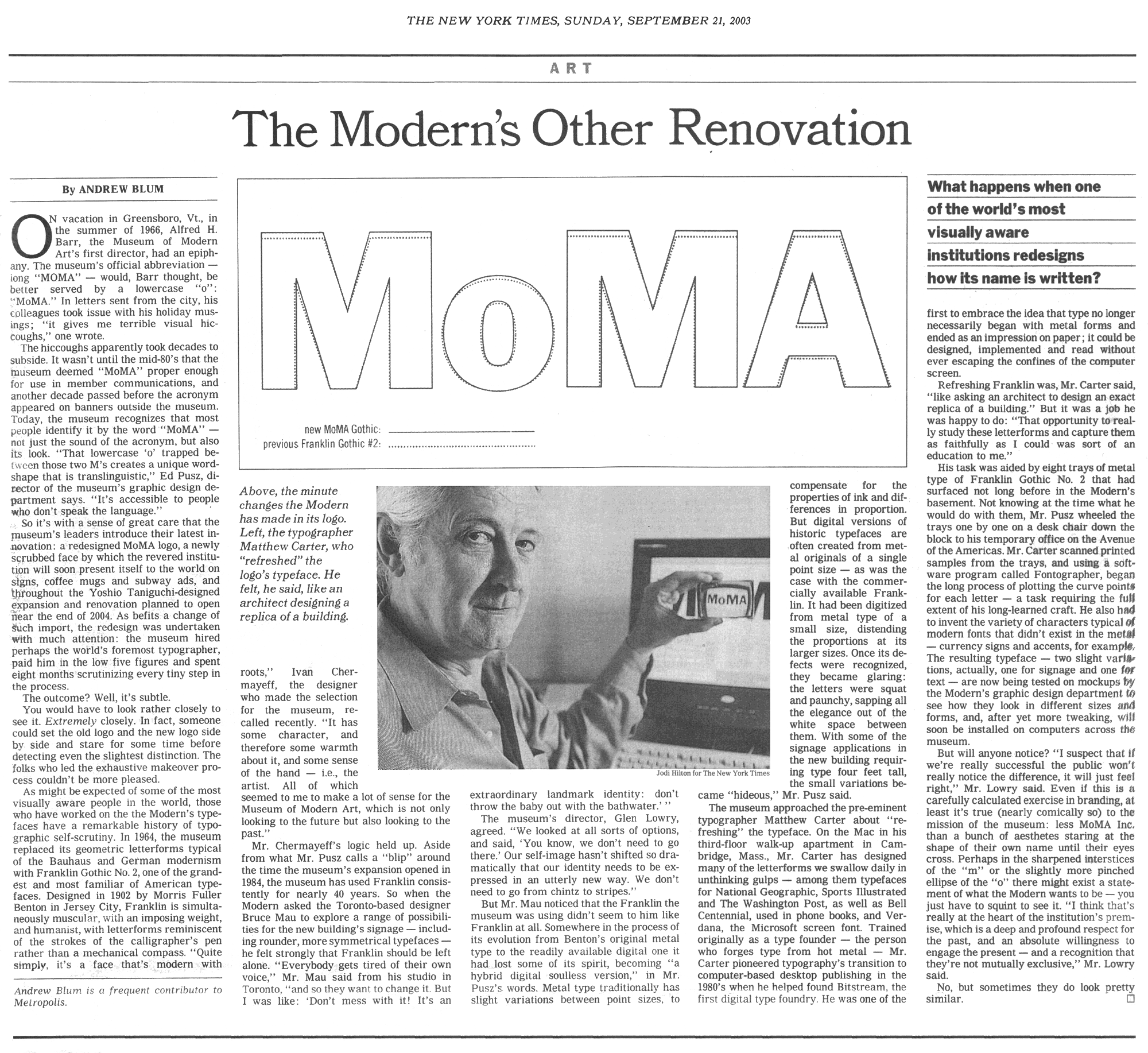
So I was excited when I came across this scan of a 2003 NY Times article on the redrawing of the MoMA logo. The legendary Matthew Carter was hired to do the refresh in which the changes were minimal but the results were significant.

Fresh new work by one of my favorite studios.

I absolutely hate MySpace. Between the ugly designs and the terrible usability, it’s a nightmare of an experience. That’s why it’s refreshing to see MySpace associated with something that’s smart and visually pleasing.
Area 17 was recently hired to develop the brand identity for a MySpace initiative called Never Ending Friending. Here’s some info on the initiative.
Depending on your vantage point, social networking means something completely different – a fad, tool, disruption, opportunity or some combination of them all. In 2007, MySpace embarked on a nationwide “listening tour” in order to create qualitative research among users of social networks. Additionally, they fielded a quantitative study among a national sample of social networking users and non-users. Together, these two methods uncovered a myriad of motivations, attitudes and behaviors that were presented through a book and at an exclusive private event in Beverly Hills.
Area 17 designed a book as well as all the printed materials for the event. Great use of Avant Garde and geometric shapes.