
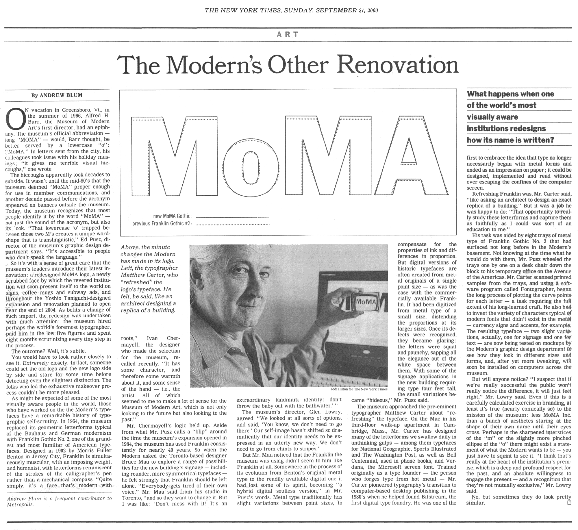
For me, one of the most exciting and rewarding aspects of design is the details. That’s where I spend most of my time and even though the untrained eye probably won’t notice them, the details still make the design better.
So I was excited when I came across this scan of a 2003 NY Times article on the redrawing of the MoMA logo. The legendary Matthew Carter was hired to do the refresh in which the changes were minimal but the results were significant.
A fascinating article, thanks for the link!
Richard, no problem. Thanks for reading!
Interesting read. Thanks.
cheers for the scan, this is a really interesting article.
Antonio,
I really enjoy the more historical posts alongside the contemporary work you post. It’s a healthy balance. Thanks
James, glad ya like!