A lot of great work to soak up by Berlin based Studio Laucke.
AisleOne. A visual journal on design, photography, film, music and culture.

A lot of great work to soak up by Berlin based Studio Laucke.

Just when you’ve thought you’ve seen it all, you stumble across something like this Swiss site containing a MASSIVE amount of work from legendary designers like Brockmann, Ruder, Bill, Hofmann, Stankowski, Rüegg, Lohse, Huber, Tschichold and more. This is the motherload folks.
It just goes to show how prolific these designers were, especially Brockmann. I thought I’ve seen most of his work, but this site contains many designs that I’ve never seen, like the one pictured here. It’s like rediscovering him all over again. Not sure how he was able to get all the work completed. I can’t imagine ever producing this amount of work in my lifetime. Amazing.

100 Days is a fascinating project by Jessica Svendsen in which she created daily variations of Josef Müller-Brockmann’s excellent Beethoven concert poster. The project was part of the Michael Bierut 100 Days Workshop at the Yale School of Art.

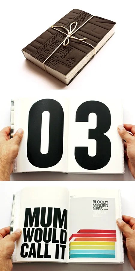
About a year ago, I was asked by Designers Against Human Rights Abuse (DAHRA) to participate in a project called Memories, which is raising money for Maggie’s Cancer Caring Centres. Cancer has deeply affected my life, taking both of my parents at a young age, so it was a real honor for me to be a part of this.
The ultimate outcome of the project is a book that tells ten stories of individuals who have survived cancer, as well as those of people who have lost loved ones to this deadly disease. Artists, illustrators and designers were invited to create their own visual response to the “memories”, and I was fortunate enough to have been included in this wonderful project. Proceeds from the book will be donated to Maggie’s.
The piece I did can be seen in the last image to the left. Here’s a larger version of it. I’m going to save the details of the story for the book, but basically the story I was assigned to is about a women named Kay, and the time she spent with her mother during her last days. Her mother was a librarian and loved books, so I created an abstract visual of a stack of books. The copy in the piece is something Kay’s mother would always say to her. It was a really touching moment and I felt that this would best represent the story of these two wonderful people. I was told that Kay loves the piece, which makes it all worth it for me.
The standard book will be released this summer, but a beautiful limited edition version has been created. It will be 304 pages with a blind deboss on brown faux leather cover, pvc inner cover and it’s all printed on Strathmore Pastelle Bright White and Pastelle Natural White paper stocks.
It was a joy to work on this project and I feel lucky to have been included.

Keeping with the Swissair theme, this fansite of the airline contains a ton of marketing collateral including posters, flyers and advertising. A lot of great stuff here, especially from the 60-80s.

A great write up by Shelby White on the evolution of the Swissair logo starting in 1931, up until the company ceased operations in 2002.