


Wonderful identity design by Atlas for the Barcelona Design Museum. You can see more of Atlas’ excellent work on Facebook and Instagram.
AisleOne. A visual journal on design, photography, film, music and culture.
Wonderful identity design by Atlas for the Barcelona Design Museum. You can see more of Atlas’ excellent work on Facebook and Instagram.
Back in the day, I used to assemble my wireframes and designs into a presentation deck, printed it all out, and then reviewed the work with my team/clients. Many designers still do this today, and it’s a bad habit developed in the agency world where everything is printed out and put up on a board for review. Some folks might not print everything out, but they’ll still view the static screens side-by-side on a computer screen. This might work for designs meant for print, but it’s a lousy way of reviewing product designs meant for devices.
Here’s why.
First, it’s important to view your designs on the actual device they’re intended for. This puts your work into context and in its environment. You get a feel for the tangible things that you don’t get with a print or static screens, for example, if a button is positioned in a location where you can’t easily reach it with your thumb, or how scrolling with your finger feels a lot different than doing it with a mouse on a monitor. This kind of stuff isn’t visible in your designs, but it affects the overall experience.
Second, an interactive prototype gives you a better sense of how the experience flows from one screen to another, in both directions. A proto also allows you to experience the transitions and interactions by actually tapping on stuff, and seeing it react. Paper or static screens don’t offer this feedback. There have been plenty of times when I’m reviewing wireframes in Sketch, and everything looks and feels great, and then I discover issues in the design when actually viewing it as a prototype.
Wireframes and UI designs should be reviewed as a prototype with basic interactions, and on the device they were designed for. The time you usually spend assembling and printing a deck, use it to build a prototype instead. Tools like Invision, Marvel, Atomic and Pixate allow you to create functioning prototypes in minutes. These services also make it really easy to share your work with your team or client, so everyone can view it and add comments.
Why have a single static screen on paper, when you can have your entire user flow, with interactions, on an iPhone. You can’t beat it.
Why does the UK get all the great design exhibits? Damn it all to hell! If you’re in London this Friday and Saturday, you’re going to want to check this one out.
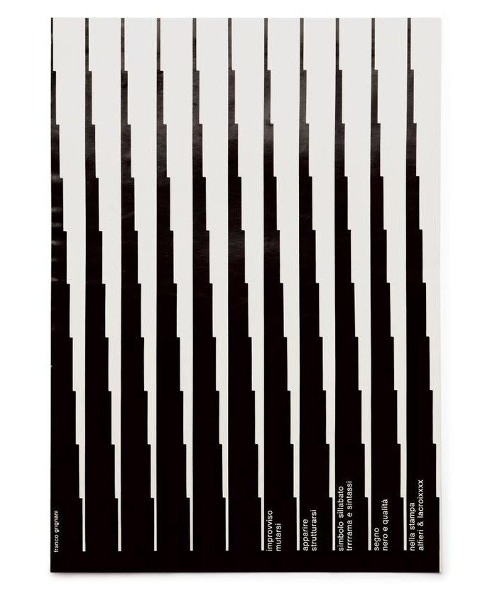
Paper company Fedrigoni has partnered with design studio SEA, and Aiap to bring us Made In Italy, an exhibition and limited edition booklet celebrating mid-century Italian graphic design. Made In Italy will feature work from Giancarlo Iliprandi, Franco Grignani, Heinz Waibl, Mario Dagrada, Mimmo Catellano, and more.
The exhibit will be open from Friday, June 12th to Saturday, June 13th at Protein: Studio 2 gallery in London.
You can purchase tickets to the event from here.


I’ve always approached design in a systematic way. Thinking about things in basic pieces that together form other pieces.
I remember assembling those plastic car models when I was a kid, and always starting with the basic parts, that by themselves didn’t form anything, but once assembled with other parts, they’d form a vital component of the car.
I’d isolate the rim, tire and bolts, and focused on them individually to form the wheels. Then I’d join the wheels with the axles, and suspension to form the front-end. And finally, the front-end would be assembled to the chassis to complete the car.
I did this for every section of the model. I never tried to assemble the complete car all at once. By doing this, I could ensure that each part was precisely assembled and functional, which would make for a better car model at the end.
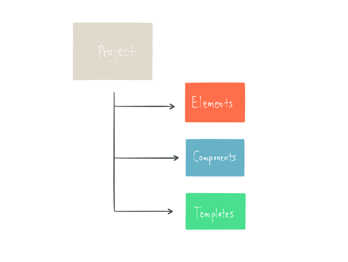
This has been my approach to product design. Instead of designing a screen or page, my method is a design system consisting of Elements, Components and Templates. Each a different stage in the process.
Brad Frost’s atomic design is very similar to my approach, but with additional stages. I definitely recommend reading it.
Here is how my system works.
Elements are the core parts of a design. They’re the buttons, input fields, checkboxes, radio buttons, drop-down, icons, colors, type styles, grids, and so on. These are some of the standard elements, but each design will dictate its own set.
I think of elements as the “seeds” of my design. They start off as a single thing, and then grow into something more useful when combined with other elements.
First, I design the elements individually. I really like to focus on how the element is formed, and the details associated with it. Then I look at how the elements work together and adjust from there.
A component is set of elements that are assembled into something functional. They’re self-contained and usually focus on doing a single task. Combine a header style, a paragraph style, a close icon, a color, and a button to form a modal. A search form, footer, and a filter selection are all examples of simple components.

Components can also be more complex, like a persistent shopping cart. These type of components still focus on a primary task, but they also allow you to do secondary tasks. For example, in a persistent shopping cart, its main job is to display cart items and total price, but it can also allow you to delete an item, or change its quantity.
Templates are where components come together to form the interface and experience. For example, a contact template on a website will be made up of a navigation, form, and footer components. Templates can represent a single section of a website, and an entire user path, like a registration flow.
I create two kinds of templates: UX templates and UI templates.
A UX template is a wireframe where the content structure and user experience are defined. Here I start piecing together the components, moving them around like puzzle pieces, slowly forming the experience and content structure.
The UI template is where I shape the layout and refine the visual styles, using the UX template for structure. As I mentioned above in the Elements section, I start with designing the individual elements. I then design the components and full templates, and refine any elements that need it. For example, a button might look perfect on its own, but it ends up being too big as part of a component or template.
This system is also great for creating a folder structure, and building pattern libraries.
My top level folder is always the project, usually based on the platform, for example iOS, Android, Web. Within the project folder lives the system I’ve outlined above:
01 Elements
02 Components
03 Templates
I assign the numbers to keep the folders in a specific order.
Within each main folder I break down the category. So for example, inside the Elements folder you’ll find folders for Buttons, Colors, Icons, Input, Typography, etc. In Components you’ll find folders for Navigation, Search, Footer, etc. Inside each of these folders you’ll find a design file for that element or component.
The Templates folder is a little different. Same idea, but within a template folder I will break it down into two folders: UI and UX. This keeps things more organized. Sometimes components will have wireframes associated with them, so the Components folder can be divided this way as well if needed.
Files are named using the following convention:
platform-type-version.extension
So, for example, the first version of a website homepage template done in Sketch would be named web-homepage-v1.sketch.
Not only is this your filing system, but it also acts as your pattern library. The entire system is clearly organized, with every file easily accessible.
If you build these files in a smart way, like using Symbols and Layer and Text Styles in Sketch, or Smart Objects in Photoshop, you save a ton of time when making a change because you just do it in one place. Symbols in Sketch are a bit limited in this case, since they don’t sync across files, but it’s still a good way of setting up your files.
This system also makes it really easy for people new or unfamiliar with the project to find and navigate the files. Great for when adding new members to the team, or sharing files with companies or clients.
For me, designing this way just makes sense. A systematic method provides consistency for the user interface, user experience and functionality. It also offers great flexibility and efficiency, because by designing at the elements level, instead of focusing on a single screen, you’re creating a design that’s modular and scalable.
This method works for me, and it might work for you. I’ve opened up the comments section to get a discussion going. I would love to hear from you if you’ve implemented the system in your workflow, or have any questions or comments.
Special thanks to Stephen Meszaros for his input and always brilliant insights.


StudioSmall is a London-based agency that produced this lovely work for fashion brand, Margaret Howell. The work includes strategy, branding, digital, print, and environmental.
Last year, Bentley produced a short film shot entirely on an iPhone 5s. They’ve produced another Intelligent Details film for their bespoke driving jacket, and this one was shot entirely on an iPhone 6 and 6 Plus.
Two things fascinate me about this film.
First, it’s amazing the level of quality the iPhone camera can produce. This film is beautiful. Granted, professional film techniques were used by pro filmmakers, but it’s incredible what can be achieved with the iPhone. The only quality the footage is still lacking is shallow depth of field. You do get some bokeh on the iPhone 6, but not shallow enough to where it gives the footage that dream-like film look. Maybe one day.
They also produced a behind the scenes showing what went into creating the film. I love how they used an anamorphic lens to produce a wide 2.4:1 aspect ratio.
The second thing that I love about this film is the peek into the bespoke tailoring world. I love fashion, and to see it done at this level is wonderful. The film features four bespoke houses from Savile Row designing and tailoring a bespoke driving jacket for Bentley. My favorite designs are from Henry Poole and Gieves & Hawkes.