
Some nice work by Ross Gunter. I really love his poster designs for Bridging the Gap.
AisleOne. A visual journal on design, photography, film, music and culture.
Some nice work by Ross Gunter. I really love his poster designs for Bridging the Gap.

I’ve written about this studio before, and it’s a site I check in on everyone now and then. Always great work coming from Workroom.

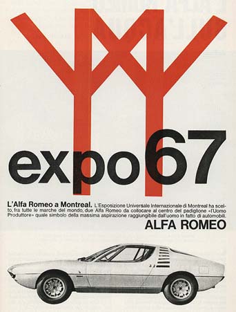
Expo67 was the of most successful exhibition of the World’s Fair and it was held in Montreal, Canada, from April 27 to October 29, 1967.
The design surrounding the exhibition was extraordinary, which was developed by a number of designers. My favorite piece is this poster pictured here. I’m attracted to the super simple design and illustration, and the white space. I’ve tried to do some research on it, but I can’t seem to find out who designed it. If anyone knows, please shoot me an email.
UPDATE: The folks at Kind Company solved the mystery. The poster was designed by Ernst Roch.
You can see more pieces from the exhibition here, here and here. Oh and check out this great Alfa Romeo ad.

Really great work by Rejane Dal Bello. I particularly love the posters done for the Amsterdam Sinfonietta music ensemble.

Here’s a great series of poster for the IBM Smarter Planet campaign, created by Ogilvy Paris. The posters make use of the excellent Lubalin Graph typeface by Herb Lubalin, and simple illustrations to form a stunning visual.
Read more on Fonts In Use about how the typeface is used in the campaign.

Fantastic work by Netherlands by designer Marius Roosendaal. I really love the worn look given to each piece. He also uses a lot of design queues frequently found in pieces from the modernism movement. Makes them feel like they were designed in the 50s and 60s. Love it.