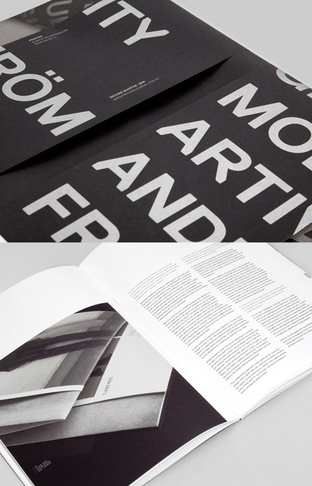
Pentagram created this wonderful booklet that celebrates the completion of a special piece by designer Max Lamb. I love the spreads in which the images span across both pages.
AisleOne. A visual journal on design, photography, film, music and culture.

Pentagram created this wonderful booklet that celebrates the completion of a special piece by designer Max Lamb. I love the spreads in which the images span across both pages.

Thomas Williams, one of the talents behind the excellent Process Journal, has documented the changes that were made to the grid system for Edition Two of the journal. Thomas writes:
The Process Journal grid has undergone several updates for Edition Two, the major change being an increase in the size of the internal gutter from 30mm up to 40mm. Although this may appear to be only a minor adjustment, it changes the dynamics of the grid in several different ways.
The extra 10mm was taken from the outside columns, otherwise reserved for image captions and room for the reader’s thumbs to hold the publication (with minimal overlay of the content). The space was removed evenly from these columns to minimize the change in visual consistency from the previous edition.
Increasing this gutter also proved to be advantageous to the overall layout of the publication and resulted in three outcomes: firstly, by centralizing the content further into the middle of the page allowing more padding and easier reading of type that falls within the two central columns; secondly, it allows a larger clearance for images placed over or near the edge of the gutter—thus minimizing the loss of image into the spine; and lastly, the increase results in an overall wider area of content.
The original objective was to create a grid that was flexible enough to deal with a wide range of content, enable flexibility and retain visual consistency. This objective still remains; hence the vast majority of grid has been unaltered and has proven itself worthy for a second time. In our experience it is a rare to have the chance to revisit and refine a project so we have embraced the opportunity and believe that small changes like these contribute to our endeavor of producing an always-improving publication.

Oppositions was an architectural journal by the Institute For Architecture And Urban Studies that was published from 1973 to 1984. The magazine was designed by the great Massimo Vignelli and it sure doesn’t disappoint with its obvious grid layout. This Flickr set includes a bunch of the covers, some of which feature black illustrations, and this set by Paul Soulellis has some shots of the inside spreads.
I was outbid on a copy of this a few months back. Would have made a great addition to my collection — maybe I’ll start to obsessively search for them now.

Issue #5 of the beautifully designed NEWWORK Magazine by Studio NEWWORK is now available. This issue features contributions by Rudolf Hostettler, Jost Hochuli, TGG Hafen Senn Stieger GMBH, Gaston Isoz, Jürgen Bergbauer, Taka Mayumi, and Lillian Bassman.

There’s something about the Lacoste brand and products that I love: they’re well-designed, detailed and minimal. So I’m excited to see that these concepts were extended to their new book, Lacoste: The Element Of Style? by Olivier Margot?. The book presents the visual history of this classic brand in a well-designed package. I personally love the simple design of the cover — which comes in 5 different color-ways — and the canvas texture.
I did some quick searching and couldn’t find any info on the designer of the book. I wonder if Lacoste did it themselves.
You can grab a copy of the book from Amazon or Assouline?.

Elegant work by French designer Carine Collin. Simple and clean but yet very detailed. I also love the website.